It’s no surprise that A+ Content (formerly known as Enhanced Brand Content) is one of the most effective tools a seller can use to enhance brand identity and develop trust with the Amazon shopper. What’s surprising is A+ Content is also perhaps one of the most neglected sections of an Amazon listing.
The majority of A+ Content found on Amazon relies on generic modules consisting of several variations on the same module design: 1-4 spaces to upload images, and 1-4 spaces to insert unformatted text. Generic A+ Content delivers an average conversion rate increase of only 5% when applied.
Here are the 9 attributes SupplyKick’s brand and design experts consistently use when developing A+ content that have proven to drive a 25% increase in conversion rate and grow product sales.
The first step in creating A+ Content is to consider all of the different ways to successfully show the core selling points of the product. Then choose the options that are the most effective and the most eye-catching. Consider questions such as, would your selling points be understood through icons and illustrations? Maybe through close-up images of the product, or through annotated photography? Amazon shoppers respond much more positively to being shown what makes your product special, rather than being told.
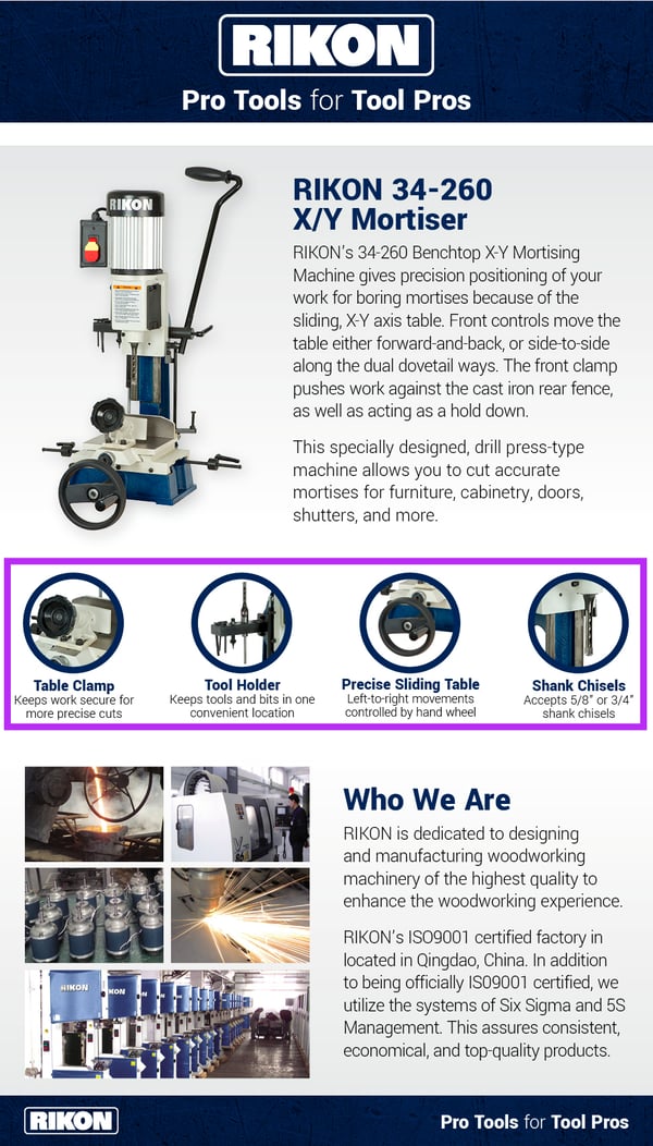
We paired four callouts with high-quality images, allowing the shopper to have a visual touchpoint for the most important key features on this RIKON Mortiser.
It’s unrealistic to think that an Amazon shopper will spend several minutes reading multiple paragraphs of A+ Content. The Amazon shopper responds better to short and simple value propositions.
Be selective with what information you share. Consider including only what the consumer will be most interested in learning about your product. You have limited real estate for A+ Content, and limited time before the Amazon shopper clicks away, so use that restricted time and space as effectively as possible to communicate the most important concepts.
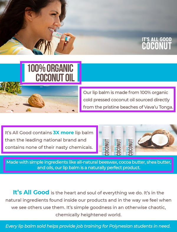
By focusing on the most important information, we created A+ Content for It’s All Good Coconut that allows shoppers to quickly analyze the A+ without being overwhelmed by excessive content.
Every product on Amazon is in competition with dozens of other products. And because of Recommended Products that appear on the listing, it’s more crucial than ever that you make your product stand out. Inevitably, most consumers will navigate away from your listing to explore the other options on the market. The best strategy to ensure customers don’t leave your listing in the middle of their decision-making process is to show the Amazon shopper the key differentiators of your product.
Start by taking time to research your competition and then capitalize on the differences in your products in the A+ Content. (Remember, per the , you cannot specifically mention another seller or their products.)
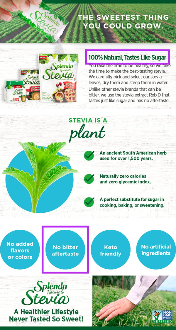
Splenda knew that their stevia line had no bitter aftertaste and tasted like real sugar, unlike their competition’s product. We incorporated this information prominently to differentiate Splenda Naturals from their competitors.
It is key to take the time to research and know the questions your customers have so you can address them upfront. For example, a brand selling health supplements should address where their ingredients come from, any certifications that add credibility, and information on how or why their products work. A brand selling a power tool should address manufacturing processes, materials that make it high quality and long-lasting, or call out features that make it safer to use.
Be sure to address key questions, hesitations, or concerns a shopper may have when they’re considering purchasing your product.
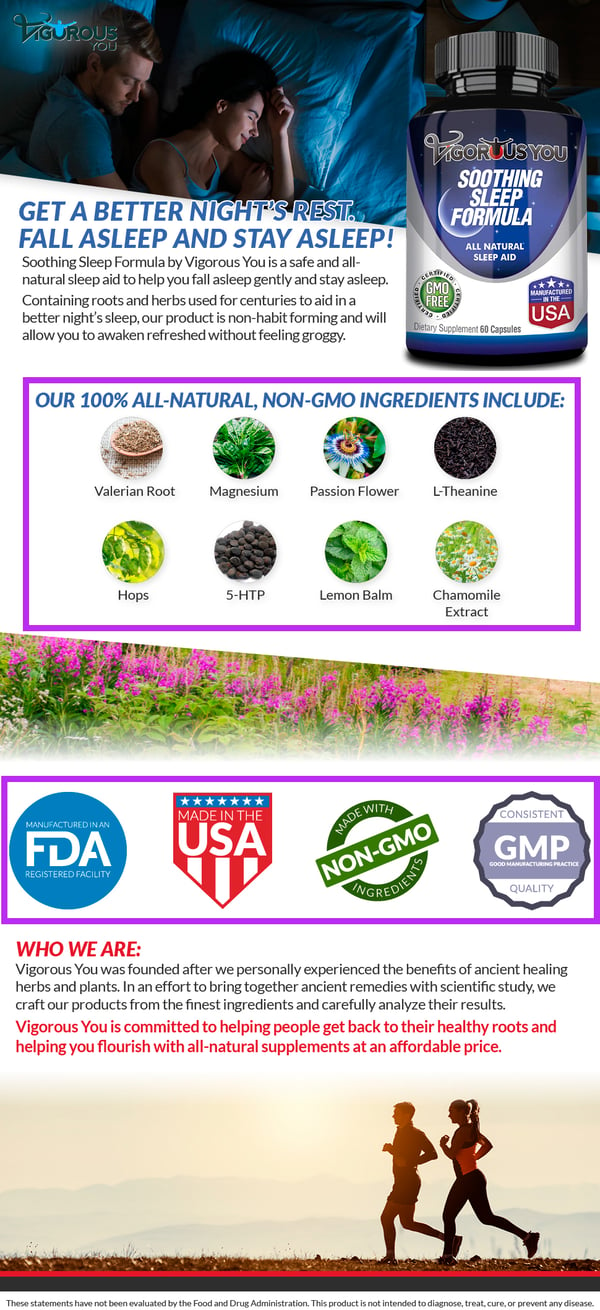
In order to preemptively address customer concerns for Vigorous You’s Soothing Sleep Formula, we included the ingredients in the supplement and accreditations used in its manufacturing so customers could feel confident in the safety and quality of the product.
Last year, Amazon averaged 264 million monthly unique visitors through mobile channels. This number is only increasing, so it's incredibly important that your A+ Content is effective in both desktop and mobile settings.
By keeping text size large and utilizing some of Amazon’s responsive module designs (i.e. “three images across” or “four images across” for callouts), you can ensure that your content is legible in any size.
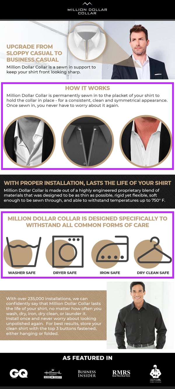
Using responsive module designs for callouts featuring iconography and large high-contrast text, we created A+ Content for Million Dollar Collar that looks great on desktop or mobile.
Comparison charts let you curate a selection of different products by creating direct links to other ASINs within your catalog.
Incorporating comparison charts in your A+ design, allows you to subtly upsell to a different version of the current product, offer an alternate choice if the current product doesn’t fit the shopper’s needs, or show them accessories that may be useful to purchase.
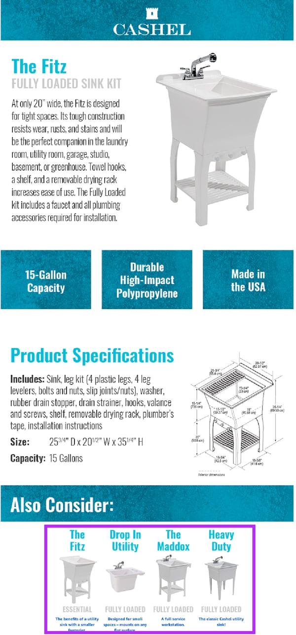
We added four other options that fit different needs on the comparison chart for the Fitz Fully Loaded Sink, giving consumers more options to choose from within the brand’s portfolio.
You'll rapidly lose a shopper’s focus if they have to search for information. Amazon’s generic A+ Content is not customer friendly and creates unnecessary work for a consumer. If possible, create your own templates and upload as an image instead of utilizing generic A+ modules.
Focus on creating a custom template that has a strong hierarchy (makes the most important information stand out), good balance (aids in legibility and helps the viewer to sort through the content efficiently), and repetition (i.e. feature 4 images in a row highlighting key features.) These design principles allow shoppers to find, process, and understand key information quickly, making them more likely to buy.
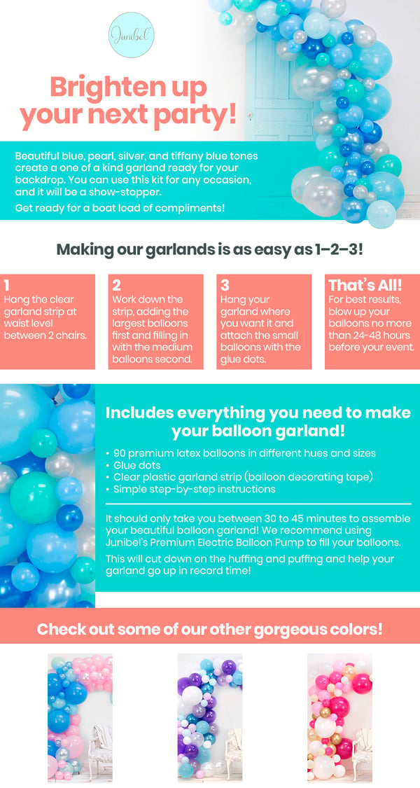
We designed Junibel’s A+ Content with a bright, eye catching design that is visually appealing and easy for consumers to follow.
The Amazon marketplace is full of low-quality products, knock offs, and imitations, leading the Amazon shopper to be wary of what they’re buying.
Consider including information about your brand or product through a module. Share your company’s history, mention accreditations, awards, or health and safety considerations pertaining to your products. This enables Amazon shoppers to feel confident that the product they’re buying is from a trusted and reputable source.
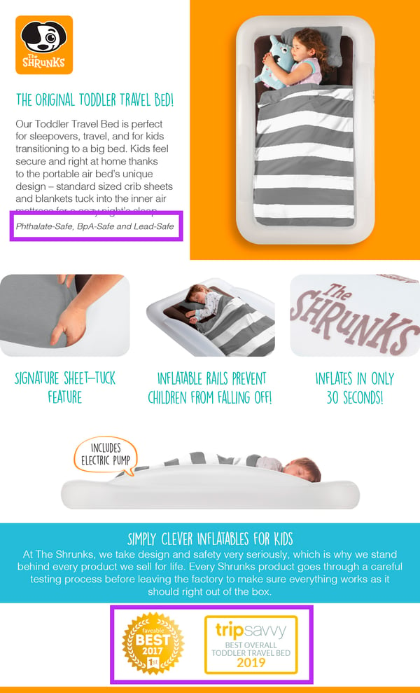
By including awards which The Shrunks have won, along with highlighting harmful toxins not found in their manufacturing process, we were able to highlight what makes their air mattresses an industry leader and superior to the many imitators in their market.
One of your most valuable assets on Amazon is a recognized and trusted brand. When you design A+ Content, make sure you create a seamless experience between your existing digital channels and your A+ Content. Utilize your brand’s typography, logo, colors, and photography to reinforce your branding on the Amazon marketplace.
By doing this, you’re not only sharing your brand with Amazon shoppers, but also acting as a touchpoint for potential customers to develop trust in your listings.
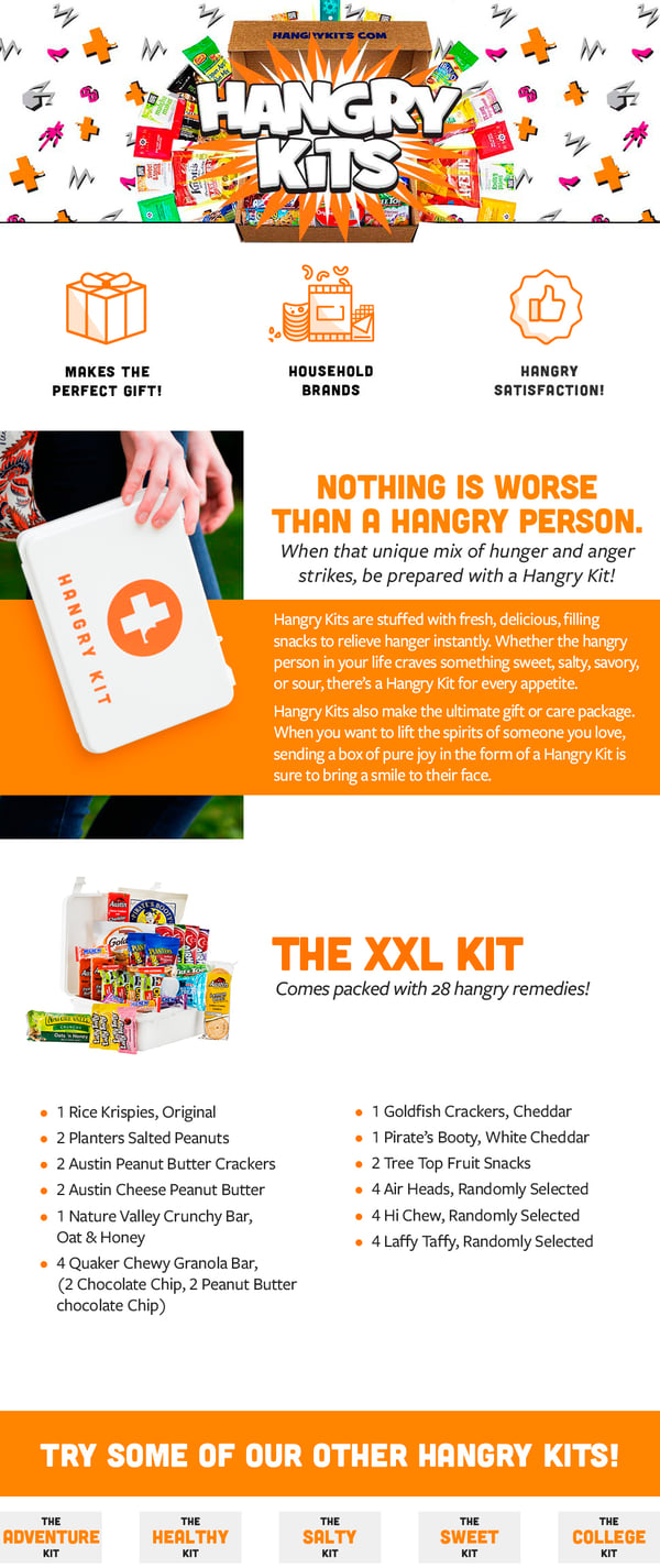
Hangry Kits is a well-defined brand. By leaning into the visual style they already have established, we were able to create A+ Content that was congruent with their website, leading to a seamless experience for shoppers.
Designing, iterating, and implementing optimized A+ Content is a lot of work. With so much to think about in regards to selling on Amazon, it’s no surprise that A+ Content is one of the most neglected sections of an Amazon listing. However, when a brand takes the time to focus on these 9 design features and creates effective A+ Content, the results will surely be seen in an increase in conversion rate. For a comprehensive how-to on creating A+ Content that converts, take a look at our A+ Content guide.
Lorem ipsum dolor sit amet, consectetur adipiscing elit


Sign up to receive our newsletter for growth strategies, important updates, inventory and policy changes, and best practices.
These Stories on Marketing
For press inquiries, please contact Molly Horstmann, mhorstmann@supplykick.com